
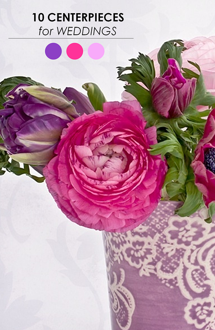
10 Creative Centerpieces for Weddings!

When it comes to weddings, there really are so many creative centerpiece ideas to choose from! From the bright and the beautiful to the soft and sweet, I'm always inspired by the creative and colorful centerpieces that I so often come across. And so today I thought I'd share with you a few of my favorites! Get ready for some fabulous floral designs, color lovers!
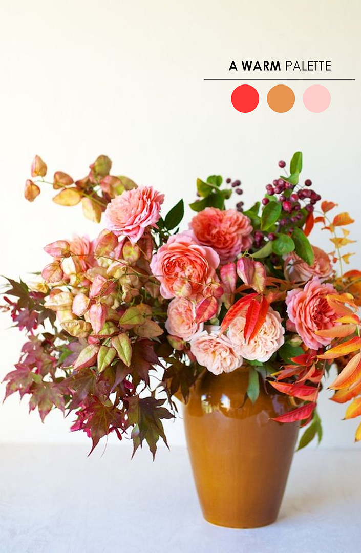
1. A Warm Palette: First up on my list is this beautiful mix of warm tones. I'm completely obsessed with this caramel colored vase. And these blooms? Aren't they just the prettiest? I'm loving the asymmetrical composition and those sweet little berries!
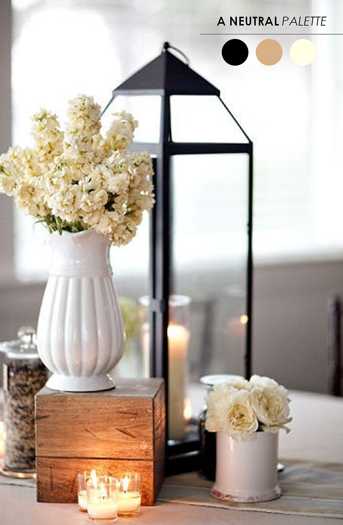
2. A Neutral Palette: Neutral tones like black, soft browns and ivory really work well together. Wouldn't you agree? I'm loving this centerpiece for many reasons, but mostly I'm loving the mix of ideas here. A charming black lantern looks really beautiful next to a couple of white vases full of blooms and a few votive candles. I really like how the different heights add interest.
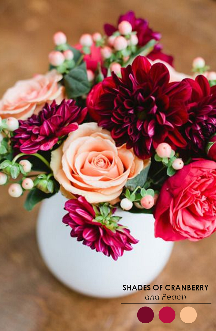
3. Shades of Cranberry + Peach: Okay, so remember when I said that cranberry was the next ''it'' color for Fall and Winter weddings? Here's another pretty example of this shade in action. I love how this florist paired it with other pretty pink and peach tones. And that white vase? Isn't the contrast just beautiful?
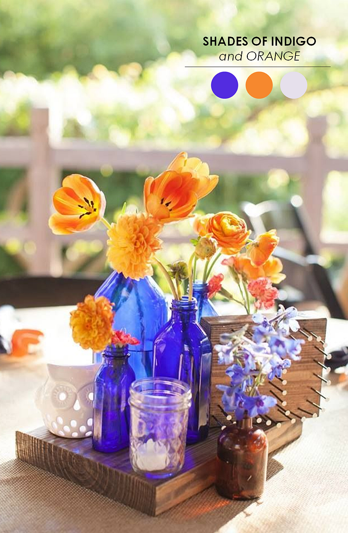
4. Shades of Indigo + Orange: A great color palette to use for Summer or Spring really has to be this fun and unexpected mix of indigo and orange. I love the idea of choosing florals in one shade and then contrasting them with a pretty vase in an opposite color on the color wheel. Such a fresh and modern feel.
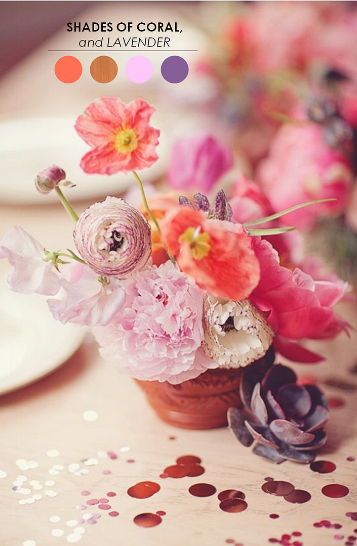
5. Shades of Coral + Lavender: This centerpiece feels so artsy to me. And for that reason alone, I'm in love. It also doesn't hurt that this florist has mixed a blooms in varying shades of coral and lavender. What a fun color palette. Bonus? A copper colored vase and confetti takes this look to a whole new level of awesomeness!
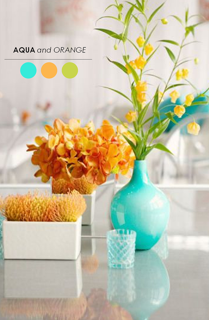
6. Aqua + Orange: Orange and aqua were just made to go hand in hand. I really like how this florist mixed different shaped vases to create a very modern look. The different heights really adds an unexpected touch and the colors just have a way of popping! Again I really like how this florist mixed in white vessels to create a very clean and modern feel.
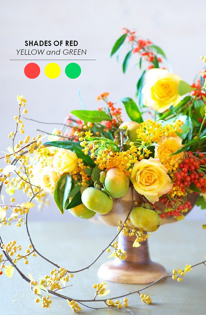
7. Shades of Red, Yellow + Green: This mix of red yellow and green really is a unique take on a Fall centerpiece. It's vibrant, it's exciting and well, I can't help but gawk. I don't think I've ever seen colors come together like this. I like the overall asymmetrical feel and those cute little berries had me at hello.
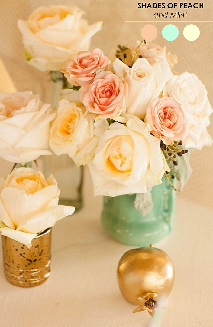
8. Shades of Peach + Mint: Soft, romantic and absolutely dreamy, when it comes to the lighter shades, these are the sort of colors I love to see side by side. Shades of peach, mint and ivory are absolutely pretty. Anyone else on board? And those gorgeous gold vases? Yeah, those totally had me at hello! Who knew that roses could be so pretty?
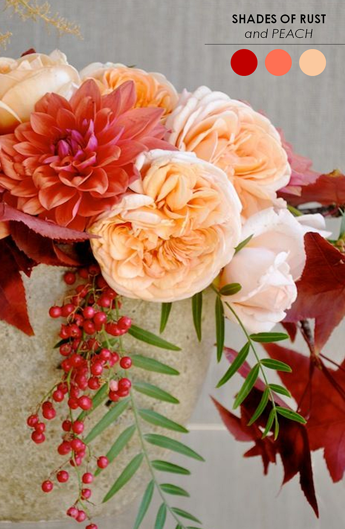
9. Shades of Rust + Peach: Shades of rust and peach is a palette that I hadn't really considered before. Throw in some coral tones and you'll have yourself a palette that is party ready. This might even be my favorite combination of these 10. I don't know what it is, but these colors really have a way of inspiring me. Liquid amber, jensenia, pepper berry, ''Charles Austin'' garden roses, scabiosa and dahlias
10. Shades of Copper + Peach: Rustic and subdued, I can't help but imagine the possibilities of a wedding in these beautiful copper and peach tones. Add in a touch of green and something sort of magical happens. I like the mix of candlelight with these smaller centerpieces. I think the contrast between tall and short really works!
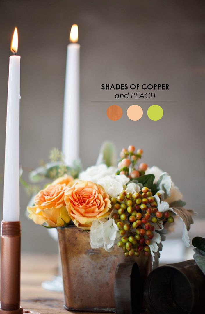
photo by archetype studio inc design by burboun and bloom vintage rentals floral design by tamara menges via style me pretty
So there you have it! 10 of the prettiest centerpieces I've ever seen. You see, there's plenty of color inspiration to be had when it comes to beautiful blooms. But before I go on, I must remind you that although you might have a color palette in mind, sometimes a florist can't guarantee exact shades.
This is because the pigment in flowers are affected by weather conditions which means that each shipment can range in color. But not to fret, I suggest working closely with your florist to come up with a mix of blooms that will work for you. Simply bring some inspiration photos to your meeting and explore the possibilities.
So I have to ask...which of these centerpieces is your favorite? And what about it makes it most attractive to you? I can't wait to hear your responses!
Share This:
Chrissy Arpie Ott
Chrissy Arpie Ott is the founder of The Perfect Palette. Since its launch in 2008, The Perfect Palette has been the go-to color resource for couples who dream of a unique, creative and colorful wedding day.


Social Links: