
Top 10 Pantone Colors for Spring 2014!
Happy Friday, color lovers! Remember a few days ago when I announced that Pantone had named Dazzling Blue their color for Spring of 2014? You know the post? The one where I gushed over what a spectacular shade of blue it was? Check it out here if you missed it. Well, today, my friends, I have another colorful treat for you. Not only did Pantone come out with the color for spring, they also announced the Top 10 Pantone Colors for Spring, 2014. So without further ado, let's dive into this lovely little list!
Dazzling Blue 18-3949, Pantone's top color pick for Spring 2014 is obviously a beauty. Looking for a color that will really wow? This dreamy shade of blue should definitely be on your short list! Looking for colors to pair it with? I suggest a crisp white or a pretty shade of pink!
Love the cool colors, but looking for a shade that is a tad more feminine? I'm loving the fact that Pantone included two shades of lavender in next year's line up! Violet Tulip 16-3823 and Radiant Orchid 18-3224 really are romantic shades. Wouldn't you agree? I love to see shades like this paired with a deep navy blue shade or even a metallic like copper.
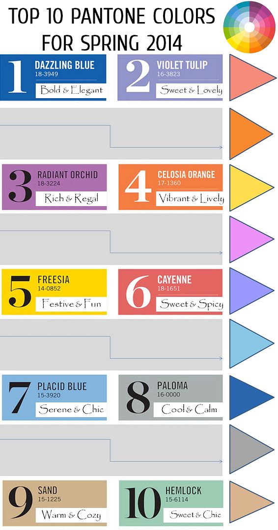
Next up on our list is Celosia Orange 17-1360 which I find to be both lively and fun. Looking for a color that will add a bit of pizzazz to the overall look? This sweet tangerine inspired shade is sure to make heads turn! Equally fun is Freesia 14-0852 that captures all the goodness of a beautiful sunshine filled day. I suggest pairing these citrus inspired hues with a beautiful neutral like soft gray.
Looking for a color to add a spicy pop to your overall palette? Cayenne 18-1651 makes a pretty accent color. I love how vibrant and lively it feels and when paired with other warm colors it really does take on a gorgeous vibe.
Placid blue 15-3920 is another shade that made the list. And I'm hoping you can see why? Such a dreamy shade and so absolutely versatile! Here lately I'm loving shades of blue paired with soft shades of peach. What's my favorite color that made the list, you ask? Hemlock 15-6114 really takes center stage in my opinion. Sweet, chic and absolutely pretty, it's colors like these that make my heart sing!
And not to be forgotten, Pantone made sure to include two of the prettiest neutrals I ever did see. Paloma 16-0000 and Sand 15-1225 are the perfect anchor colors and would mix perfectly with any other shade featured here. That's what I love about a good neutral. They're so versatile. So there you have it! Just a few of my thoughts on the Top 10 Pantone Colors for Spring, 2014! Love this post and want to see more like this? Be sure to stop by later this week when I'll be talking more about each of these pretty shades.
Share This:
Chrissy Arpie Ott
Chrissy Arpie Ott is the founder of The Perfect Palette. Since its launch in 2008, The Perfect Palette has been the go-to color resource for couples who dream of a unique, creative and colorful wedding day.


Social Links: