
{pantone palette}: blue ribbon 19-3839
Well, hello there friends and Happy Friday! I hope you all had a lovely week! Today I'm kicking off the weekend with a Pantone color that I'm absolutely smitten with! Remember last week when I told you that I'd be taking some of my favorite Pantone colors and sharing wedding ideas to coordinate? Well, today I bring you Pantone 19-3839, Blue Ribbon! Classic, preppy and all kinds of pretty...Blue Ribbon has so much party planning potential.

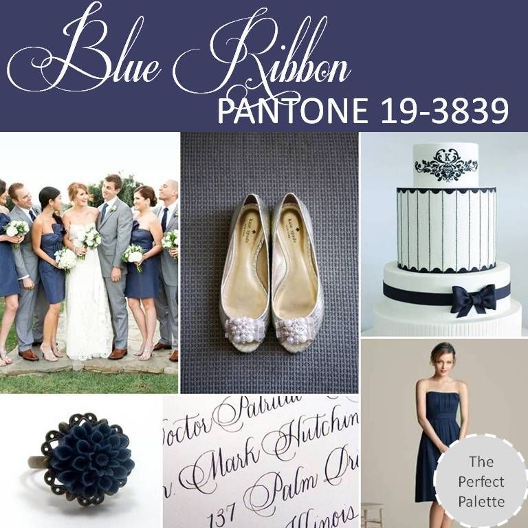
Blue Ribbon has to be one of the preppiest shades of blue I ever did see. I'm really liking how this color feels so proper. An unexpected neutral, this color would work well with a nautical theme or even in a country club type setting. It's a sophisticated shade that mixes well with crisp white or even neutrals like gray tones. So what do you think? Are you as in love as I am with this preppy shade of blue?
Share This:
Chrissy Arpie Ott
Chrissy Arpie Ott is the founder of The Perfect Palette. Since its launch in 2008, The Perfect Palette has been the go-to color resource for couples who dream of a unique, creative and colorful wedding day.


Social Links: